form magazine re-design 99
lead design / tradition / change / international
employer: publishing company form, frankfurt (germany)
editor-in-chief: petra schmidt, frankfurt (germany)
design: sarah dorkenwald and annette müller, frankfurt (germany)
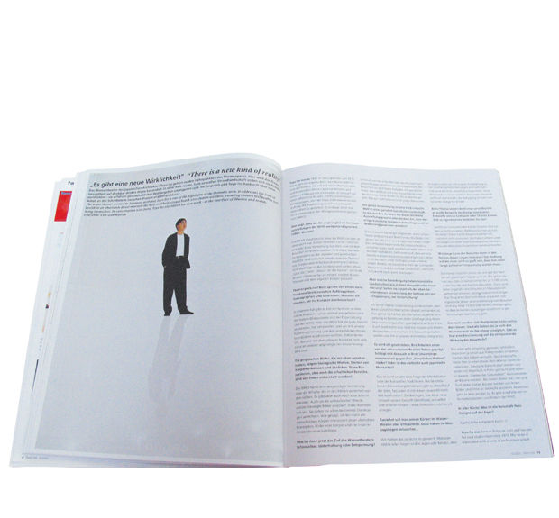
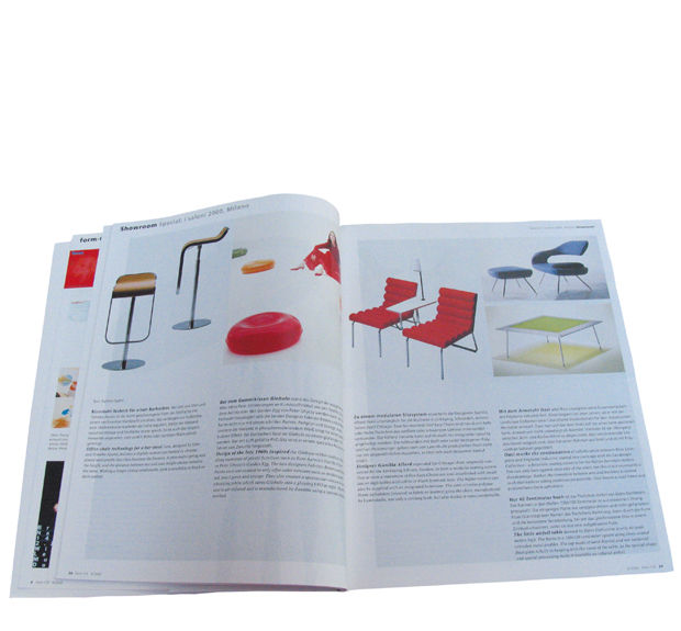
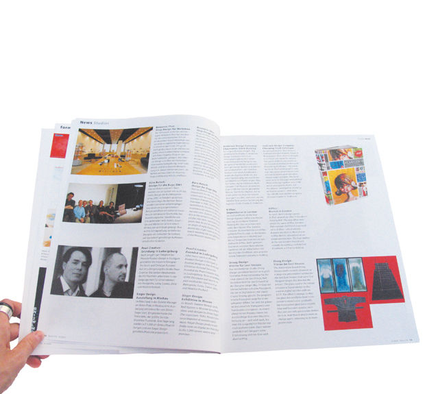
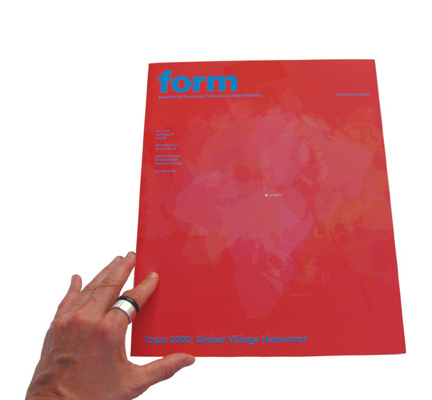
when sarah dorkenwald started the project of developing a new identity and art direction for ‘form’ magazine, she was asked to take into consideration the traditions that had developed throughout its history of more than 40 years as a professional industrial design magazine. together with petra schmidt, editor-in-chief, and graphic designer annette müller she devised a new shape for ‘form.’ issue 170 of the ‘magazine for design’ marked this relaunch, complete with a new subtitle ‘the european design magazine.’
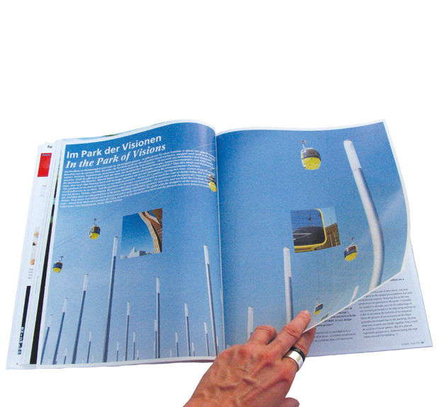
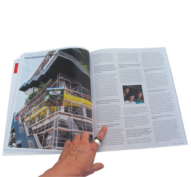
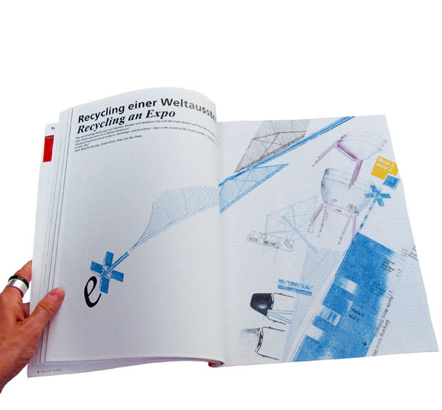
the requirements were to preserve integrity and historical reference, but also to achieve a more contemporary and international relevance for the publication. furthermore, a new grid and typographical treatment were needed for bilingual publication (in german and english). thus, she implemented a new basic layout, generated by new content and structure of the magazine. the resulting design, with strict horizontal / vertical separation of text and images and the variability of white space, became a signature for the modern look of the magazine. the fonts are ‘form frutiger’ in german and concorde in english. lucas de groot reworked the font frutiger designed by adrian frutiger exclusively for the magazine for better legibility.
