deutsche bahn 11
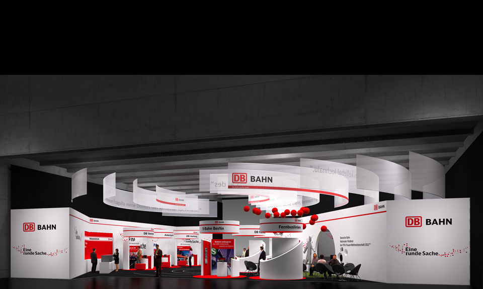
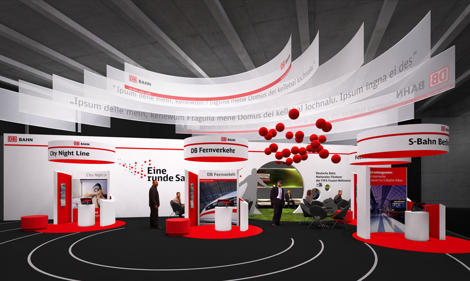
circle / inside-outside / pulsating / global
studio: expolab, munich (germany)
architecture: ina sauter, wuppertal (germany)
concept and design: sarah dorkenwald, munich (germany)
client: deutsche bahn, frankfurt (germany)
fair: itb, travel trade show, 2011, berlin (germany)
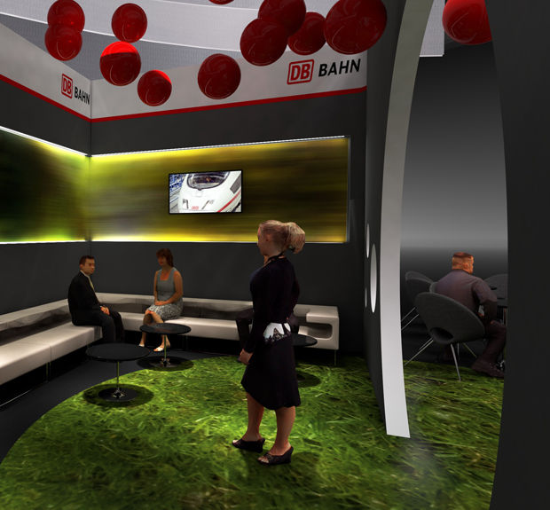
the proposal of the exhibition booth of deutsche bahn for itb berlin 2011 follows the principles of inside-outside. with this concept sarah dorkenwald wanted to create a design which conveys both a distinct outer appearance of the company with a clear formal language and calm colors such as white and dark gray as well as the ‘inner world’ of the company (media, display, information, service) which is constantly in motion, modernizing, and optimizing itself. the corporate color red accentuates and functions as impulse-giver, while gray serves as a neutralizing complementary.
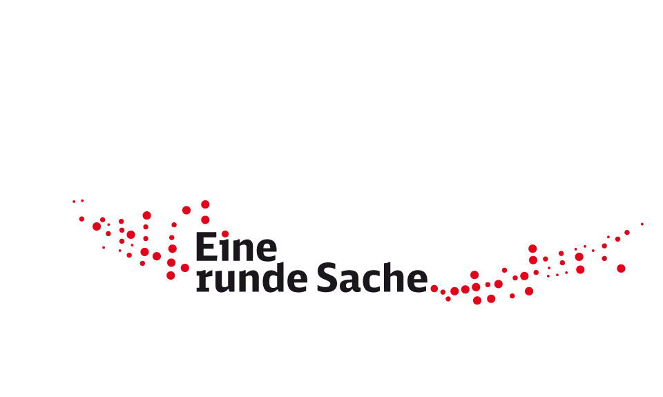
the red line is part of the corporate identity of deutsche bahn. here, it flows as a dynamic band accentuating the architecture. it forms a circle or red dot and serves as a means of orientation. the red dots playfully encircle the motto ‘eine runde sache,’ (‘covering all bases’) which reflects the diverse and extensive services of deutsche bahn corporation. the claim also humorously links back to the fifa soccer womenworldcup 2011, for which deutsche bahn is one of the main sponsors.